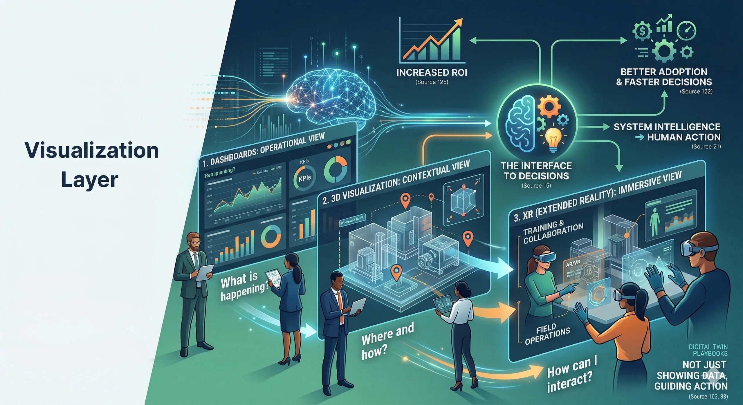
A Digital Twin that cannot be understood, will never be used, no matter how powerful it is.
Introduction
In the previous articles, we explored:
data pipelines
integration
cloud vs edge
AI/ML intelligence
All of these build the foundation of a Digital Twin.
But there is one final layer that determines whether the system actually delivers value:
👉 Visualization
Because decisions are not made on raw data.
They are made on what people can understand and trust .
The Core Idea: Visualization is the Interface to Decisions
Visualization is often misunderstood as:
dashboards
3D models
visual effects
But in reality, it is:
👉 the interface between system intelligence and human action
The Three Key Visualization Layers
1. Dashboards: The Operational View
Dashboards are the most common interface.
They help users:
monitor KPIs
track system performance
receive alerts
Best for:
operations teams
monitoring and reporting
quick decision-making
Strengths:
simple and accessible
real-time insights
easy adoption
Limitations:
limited spatial context
requires interpretation
👉 Dashboards answer:
What is happening right now?
2. 3D Visualization: The Contextual View
3D models provide:
structural understanding
spatial relationships
asset-level context
Best for:
infrastructure and construction
facility management
planning and simulation
Strengths:
intuitive understanding of complex systems
better context for decision-making
Limitations:
can become heavy and complex
often overused for visual appeal
👉 3D answers:
Where and how is it happening?
3. XR (Extended Reality): The Immersive View
XR includes:
AR (Augmented Reality)
VR (Virtual Reality)
MR (Mixed Reality)
Best for:
training and simulation
field operations
remote collaboration
Strengths:
immersive experience
better spatial understanding
hands-on interaction
Limitations:
hardware dependency
adoption challenges
not required for all use cases
👉 XR answers:
How can I experience and interact with it?
The Real Problem: Over-Focus on Visual Appeal
Many Digital Twin projects:
invest heavily in 3D and XR
prioritize visual impact
underinvest in data and logic
👉 Result:
impressive demos
low operational usage
What Good Visualization Looks Like
Effective visualization is:
👉 decision-driven, not design-driven
It should:
simplify complexity
highlight what matters
guide action
Practical Example
Scenario: Smart Facility
Dashboard: shows energy consumption trends
3D model: highlights affected zones
XR: allows technicians to inspect systems on-site
👉 Combined outcome:
faster diagnosis
better decisions
improved efficiency
Ask Yourself
Are your visualizations: 👉 helping users make decisions or 👉 just showing data in a better format?
Where Organizations Go Wrong
1. Starting with Visualization
Building dashboards or 3D models before fixing data.
2. Overloading Interfaces
Too much information → reduced clarity
3. Ignoring User Needs
Designing for presentation, not for operations
4. No Link to Action
Insights are visible, but no workflow is triggered
Indian Context
In India, visualization plays a critical role because:
stakeholder groups are diverse
technical understanding varies
Clear and intuitive visualization:
👉 improves adoption
👉 accelerates decision-making
Benefits of the Right Visualization Layer
better user adoption
faster decision-making
improved operational efficiency
reduced training effort
higher ROI
Conclusion
Visualization is not the starting point of a Digital Twin.
But it is the point where:
👉 value becomes visible
👉 decisions become possible
A strong Digital Twin:
is built on data and architecture
but succeeds through clear, actionable visualization