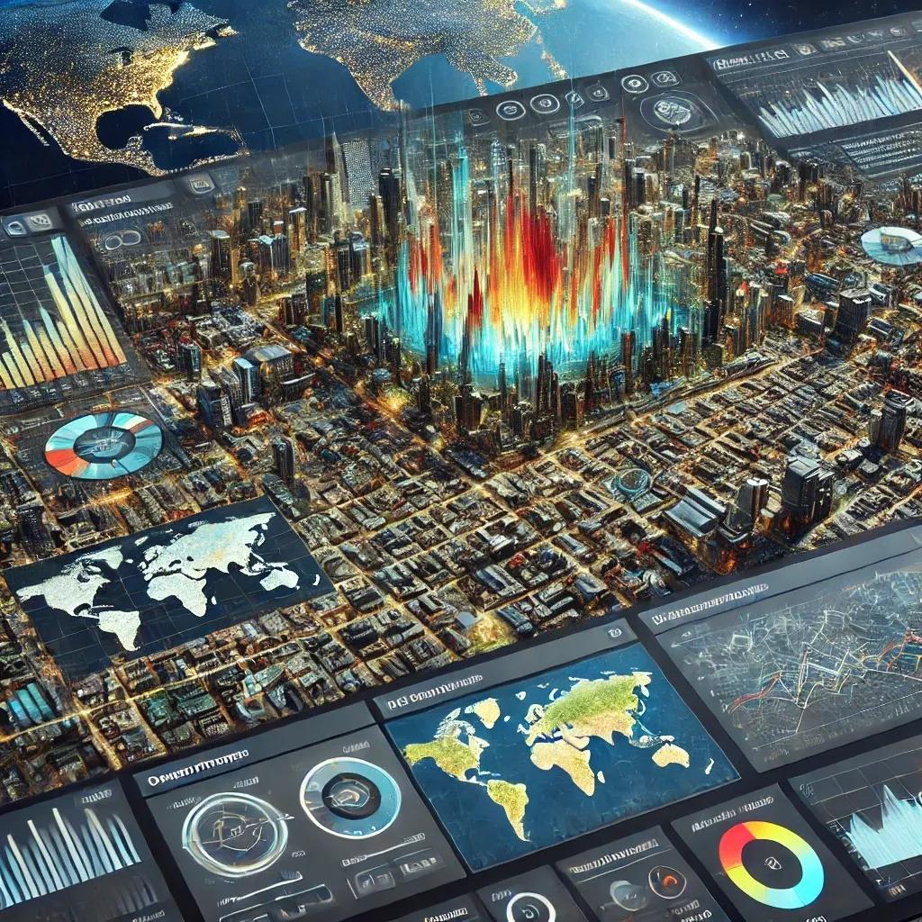
Data visualization has become an indispensable tool in various industries, offering a powerful means to interpret complex datasets in a clear and meaningful way. Geospatial data, which relates to the physical location and characteristics of objects, events, or phenomena on Earth, is particularly complex due to its multidimensional nature. Understanding geospatial insights without visualization would require immense effort, given the volume and intricacies of the data involved. Data visualization plays a crucial role in simplifying these complexities, allowing stakeholders to extract actionable insights efficiently.
This article explores why data visualization is crucial for understanding geospatial insights, focusing on its ability to convey spatial relationships, enable faster decision-making, and uncover patterns and trends that are otherwise difficult to detect.
The Complexity of Geospatial Data
Geospatial data is typically represented in multiple dimensions, combining attributes such as latitude, longitude, elevation, and time. This data may come from various sources like satellite imagery, geographic information systems (GIS), drones, and Internet of Things (IoT) devices, generating massive datasets that are difficult to interpret through traditional methods.
Visualizing this data allows users to see spatial patterns, relationships, and trends that would be difficult to discern through raw numerical or tabular data alone. In sectors like urban planning, agriculture, disaster management, transportation, and utilities, where geospatial data drives decisions, visualization transforms abstract datasets into intuitive maps, graphs, and models that are easier to comprehend and act upon.
Benefits of Data Visualization for Geospatial Insights
Spatial Awareness and Contextual Understanding
Geospatial data is inherently tied to specific locations, making it essential to maintain spatial awareness when analyzing this information. Data visualization in the form of maps, heat maps, and topographic models enables analysts and decision-makers to understand the geographic context of the data. For instance, in urban planning, maps can highlight areas of high population density, allowing planners to allocate resources efficiently or identify zones for development.
Without visualization, interpreting geospatial datasets would require processing individual coordinates, which lacks context and spatial continuity. Data visualization tools like GIS allow users to overlay multiple layers of information—such as infrastructure, land use, and demographic data—enabling a holistic view of spatial relationships.
Detecting Patterns and Anomalies
One of the key advantages of geospatial visualization is its ability to reveal patterns, trends, and anomalies that are not readily apparent from raw data. For example, in agriculture, visualizing soil moisture levels across different regions can help identify areas prone to drought, enabling more targeted irrigation strategies. Similarly, in public health, mapping the spread of diseases like malaria or dengue can reveal hotspots, allowing for timely interventions.
In contrast, manually sifting through geospatial data points would make it nearly impossible to detect these patterns, especially over large geographic areas. Visualization tools can apply statistical analysis and clustering techniques to highlight regions of interest, providing decision-makers with clear and actionable insights.
Enhanced Decision-Making and Problem Solving
In industries like logistics, environmental monitoring, and disaster management, the ability to make rapid decisions is critical. Data visualization accelerates the decision-making process by presenting complex geospatial data in an easy-to-interpret format. For example, in disaster management, visual tools such as real-time hazard maps can help emergency responders identify affected areas quickly, prioritize rescue operations, and allocate resources more effectively.
The decision-making process is not only faster but also more informed when supported by visual tools. In the logistics industry, route optimization systems that visualize traffic patterns, weather conditions, and real-time data can lead to more efficient delivery networks. Visualization helps professionals evaluate different scenarios quickly, assess risks, and devise solutions in dynamic environments.
User-Friendly Interface for Non-Technical Stakeholders
Many stakeholders, such as policymakers, business executives, or community members, may not have the technical expertise to interpret complex geospatial data. Data visualization bridges the gap between technical experts and non-experts by transforming complicated data into intuitive formats. Interactive dashboards and visual analytics tools allow users to explore data without needing specialized GIS training.
By converting abstract geospatial information into visually digestible formats, visualization empowers stakeholders to engage with the data, ask informed questions, and make evidence-based decisions. For instance, government officials can use visual tools to assess land usage or disaster preparedness in specific areas, enabling them to communicate insights to the public or other departments more effectively.
Support for Predictive Analytics and Forecasting
Geospatial data visualization, when combined with predictive analytics, enhances the ability to forecast future scenarios based on historical patterns and real-time data. In fields such as environmental conservation and climate modeling, visualizing geospatial data is instrumental in predicting events like floods, forest fires, or urban sprawl.
Predictive models, often presented through time-lapse maps or 3D simulations, allow decision-makers to visualize how certain changes, such as deforestation or urbanization, could impact specific regions over time. By anticipating these changes, stakeholders can implement proactive measures to mitigate negative impacts, improving outcomes in environmental management and urban planning.
Types of Geospatial Data Visualization
Several types of visualization methods are used to represent geospatial data, each offering unique insights depending on the context of the data and the industry involved. Some common types include:
Choropleth Maps : These maps use different shades or colors to represent data across predefined geographic regions, such as countries or states. They are useful for displaying metrics like population density, voting patterns, or health statistics.
Heat Maps : Heat maps highlight areas of high or low intensity of a particular variable, such as crime rates or disease outbreaks. They allow decision-makers to quickly identify hotspots or areas of concern.
Topographic Maps : These maps represent the Earth's surface and elevation, useful in fields like geology, environmental science, and civil engineering for understanding terrain features.
3D Models and Simulations : 3D visualizations offer a more immersive perspective, providing insights into the vertical dimension that is particularly useful in urban planning and construction. Simulations can also project future scenarios, such as the expansion of urban areas or the impact of rising sea levels.
Time-Series Visualizations : These visualizations show how geospatial phenomena evolve over time, such as traffic patterns, climate change, or deforestation. By incorporating time as a variable, they allow for trend analysis and forecasting.
Challenges in Geospatial Data Visualization
Despite its many advantages, geospatial data visualization comes with challenges. Large datasets often require significant processing power, and the complexity of creating accurate and meaningful visualizations can be a barrier. Additionally, data quality plays a crucial role in the effectiveness of visualization. Inaccurate or incomplete data can lead to misleading interpretations.
Another challenge is ensuring that visualizations are designed in a way that avoids misinterpretation. Complex visual representations may be difficult for some users to understand, particularly when multiple layers of data are involved. Striking the right balance between detail and clarity is key to creating effective geospatial visualizations.
In conclusion, data visualization is crucial for unlocking the full potential of geospatial insights. By transforming raw geospatial data into visual formats, it enhances spatial awareness, detects patterns and anomalies, supports faster decision-making, and provides non-technical stakeholders with an accessible way to interact with data. As geospatial data continues to grow in complexity and volume, the role of visualization tools will only become more significant in helping industries and governments navigate spatial challenges and make data-driven decisions.
For organizations looking to leverage geospatial data, investing in powerful visualization platforms is no longer optional—it is essential for staying competitive in a data-driven world.